


Chances are, you’ve taken your near instantaneous access to complex but easy to understand maps for granted – and who wouldn’t?
It’s easy to breeze over the usefulness of colors on Google Maps when you’ve somewhere to be, and this ease-of-use is a great example of just how important map colors are, even if we aren't always aware of them. In this guide, we’ll be covering the most common colors found on maps, and discussing how and why they’re used and what kinds of maps you may spot them on.
Have maps always included lots of color?
Maps have come a long way; compare any average modern day map with some of the best preserved vintage maps, and the differences in quality and accuracy are massive.
This makes sense too – as the science of cartography has transformed from prehistoric cave paintings of hunting grounds and ancient Roman nautical charts to three-dimensional, GPS guided works of art in just a short period of time in the grand scheme of things.
What hasn’t changed over time, however, is the presence and importance of colors included on these maps. Even before colored ink was economical to produce and use, cartographers and amateur map-makers realized just how valuable adding darker and lighter shades of color could be, as contrasting colors make maps much easier to read.
Interestingly enough, some map color schemes have barely changed at all – for example, blue ink has nearly always been used to show off water instead of land features on maps, and black ink was used to add contrasting labels for cities and towns dating back to some of humanity's earliest map discoveries.
What colors will you find on a map?
Maps of all kinds often include the entire rainbow – using a variety of colors makes it easy to add contrast, an important aspect of making a map readable for amateurs and experts alike. Not every map will include such a diverse spread, but these are the most common colors you’ll spot:
-
Black
-
Green
-
Blue
-
Brown
-
Red
-
Yellow
-
Purple
-
Other colors
What do different colors on a map mean?
So, do the colors on a map mean anything? Every map is different, but most of the time maps created for navigation will use similar colors to describe or mark specific things. For example, reading a topographic map is quite different from a raised relief map – but including green on either of them usually depicts vegetation like a forest.
Let’s talk about all the different colors you may come across while perusing some maps; we’ll list out a few possible meanings depending on what kind of map you’ve got:
Black
Almost every map will include a bit of black ink, with black being a highly versatile and effective color for communication through cartography. Because of how well it shows up when paired with multiple other colors, black is usually used to depict man-made or urban areas and landmarks, such as:
-
Roads and major highways
-
Railroads and railway crossings
-
Bridges and tunnels
-
Borders between different countries, states, and regions
-
The names of man-made structures like buildings, towns, and cities
Many other colors used in map-making will have different meanings depending on the designer and purpose for a particular map – but black colored lines are almost always going to be used for the reasons above.
Green
Green is most often used to mark the location of some kind of vegetation – things like grass or trees. Aside from obvious landmarks like national forests and state parks or farms and orchards, you’ll also find green being used to describe less common locations like golf courses, vineyards, and urban gardens.
The other thing to be aware of is if a map includes different shades of green – say a foresty dark green and a minty light green – this usually means the darker area is home to denser vegetation than the light area.
Blue
Just like green is used to represent vegetation, blue is usually reserved for water. Hydrological maps in particular use a lot of blue ink to depict our planet’s incredibly diverse range of waterways, but nearly every map will be blue for this purpose as well.
Some common uses of blue on a map include marking:
-
Oceans and inland seas
-
Lakes, rivers, creeks, and watersheds
-
Swamps, marshes, and ponds
-
Rain patterns and precipitation
-
Glaciers, particularly when it comes to contour lines on topographical maps
Brown
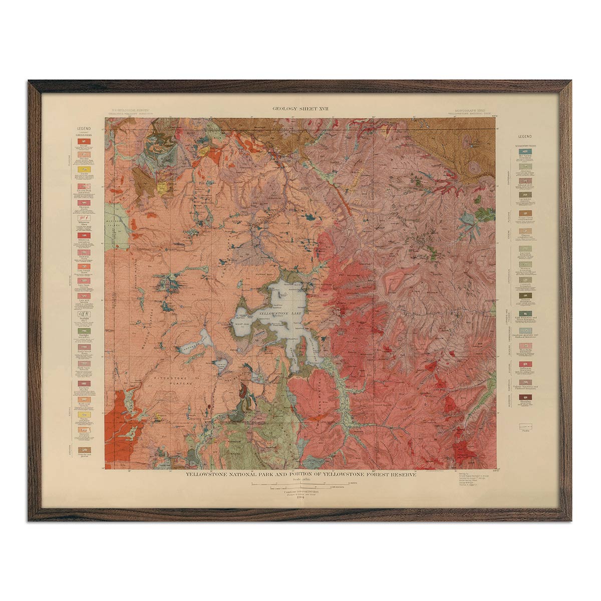
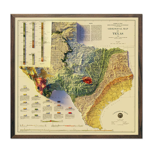
Brown is a common color to use in cartography, and is usually reserved for a few specific purposes. The main use is to depict changes in elevation, including contour lines on topographic maps, and any associated contour intervals which list out the actual elevation measurement.
On other kinds of maps, brown is useful to mark military sites and bases, national parks, historical sites and cultural features, and even desert ecosystems. In rare cases, you may find maps using the color brown to differentiate cultivated farmland from other kinds of green forested areas.
Red
A bold color, red is used to draw our eyes to important landmarks and locations. Similar to black, red is normally used for man-made locations, and the two are often interchangeable depending on the type of map. Here are some of the most common uses for red coloring on maps:
-
Major interstate highways and roads
-
Important boundaries and borders
-
Recreational areas like campgrounds
-
Airports and military areas
-
Capital cities and major towns, depending on the map
Yellow
Yellow isn’t commonly included on maps, or may be reserved for special markings as it’s a great color to contrast with darker hues like red, black, and green. You’ll find yellow being used to mark less vital but still important roads or highway numbers, as well as the actual coordinate lines that separate different areas of the map into quadrants.
Other colors
Maps can include other colors like purple, cyan, and orange – but these colors will most likely have a special meaning that’s marked on the map’s legend, a section located near the bottom that explains various map symbols and their meanings.
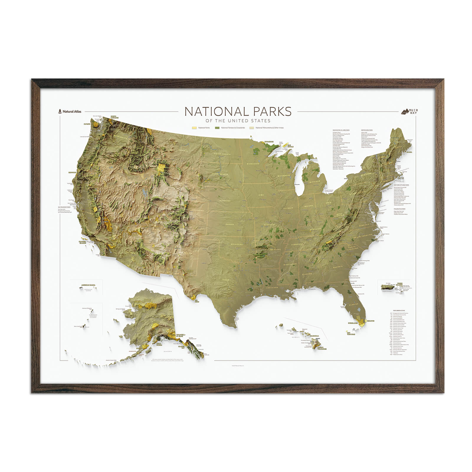
What types of maps use color?
Hundreds of different types of maps exist, as a map can serve its purpose by depicting an incredibly small or large area of our planet – the possibilities of map-making are endless, only limited by the designer’s creativity.
With that being said, most maps you’ll actually come across in your day to day will fall under one of these categories:
-
Relief maps including 3D raised relief maps, 2D shaded relief maps, and vintage relief maps
-
Topographic maps ranging from topo maps to 2D elevation maps
-
Hydrological maps specializing in the movement of water
-
Navigational charts, also known as nautical charts
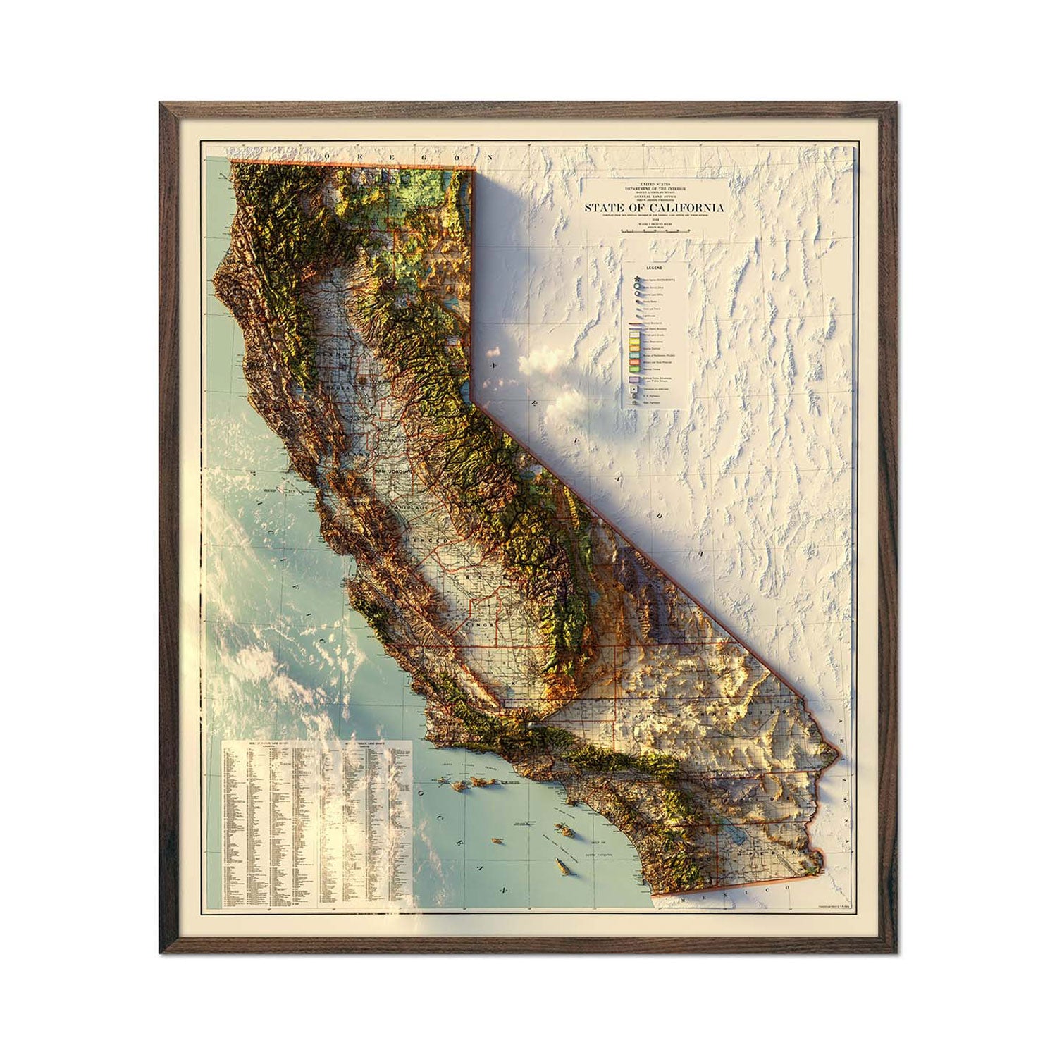
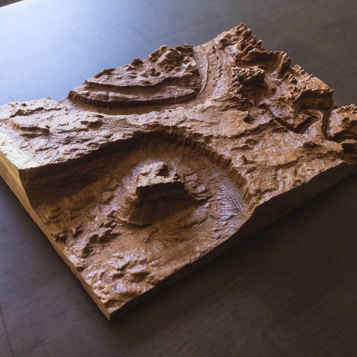
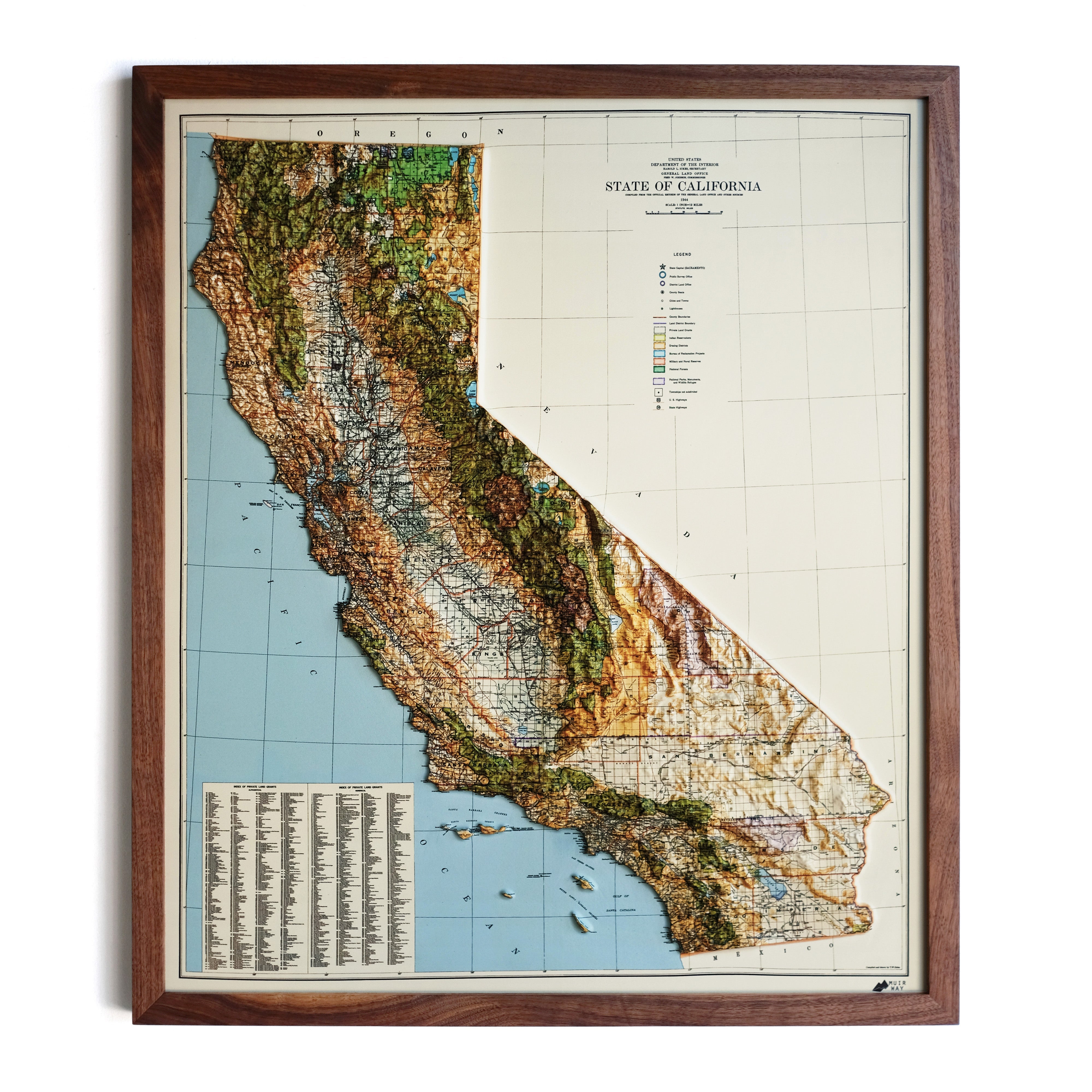
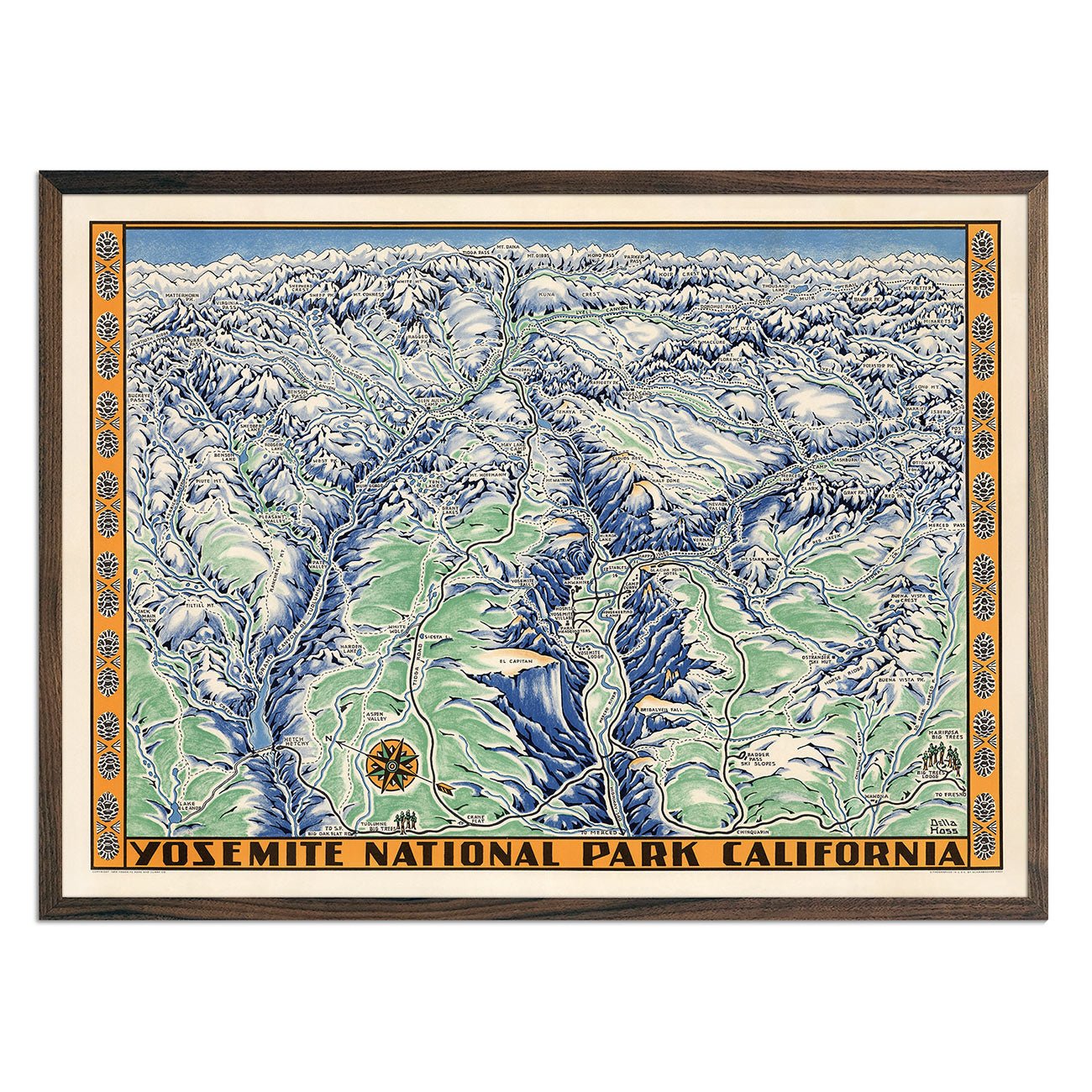
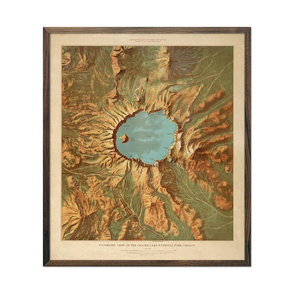
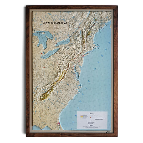
Relief maps
Map Example: our 3D raised relief map of the United States in 1931
Relief maps are used to show off the geography and elevation of a specific area on earth, sometimes even entire continents. The reason relief maps are so unique is that they’re 3D – these maps depict changes in elevation using three-dimensional art. If you’ve ever seen a globe or flat map with actual mountain ridges, you’ve seen a relief map.
These maps have seen a lot of change throughout history:
-
Physiographic illustration is a method of relief mapping combines hill profiles with shaded relief, and is still used by ski resorts to this day
-
Oblique maps were developed during the Middle Ages: these panoramic maps depict cities and landscapes from a hypothetical, aerial point of view
-
Hachure’s technique is a method of shading slope and steepness with a gradually increasing hatching of lines
-
Hillshading is a more modern technique that requires illustrations which mimic the illumination of a region being mapped by a light source, with brightly lit peaks and dimly lit valleys
By including 3D mountains, ridges, hills, and valleys, artistically inclined cartographers are able to transform a two-dimensional map into a work of 3d relief art that you can physically touch and feel in terms of elevation change, although many of them are simply just shaded in a manner that makes it appear fully three-dimensional.
Relief maps are famously known for including a wide range of muted and bold colors, with contrast being an important part of effectively drawing 2D or 3D changes in elevation.
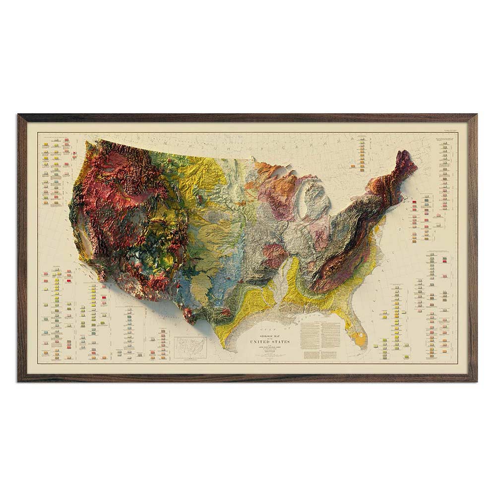
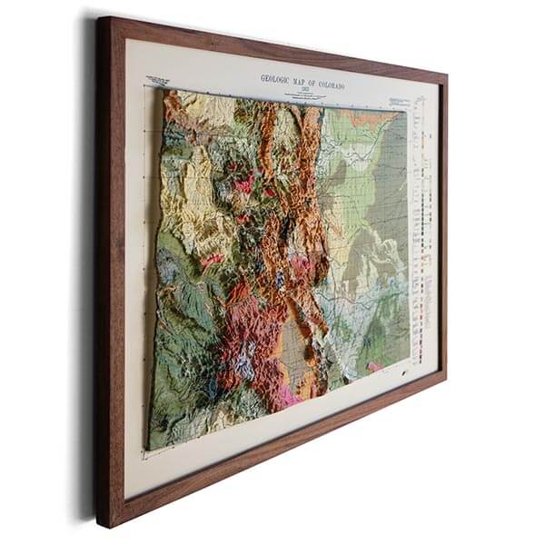
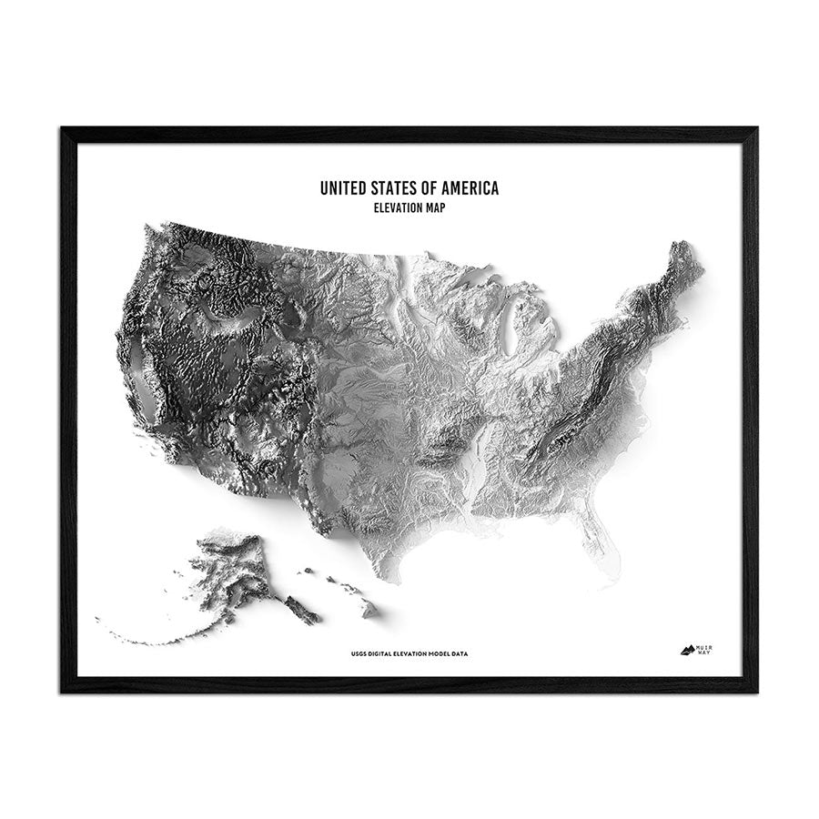
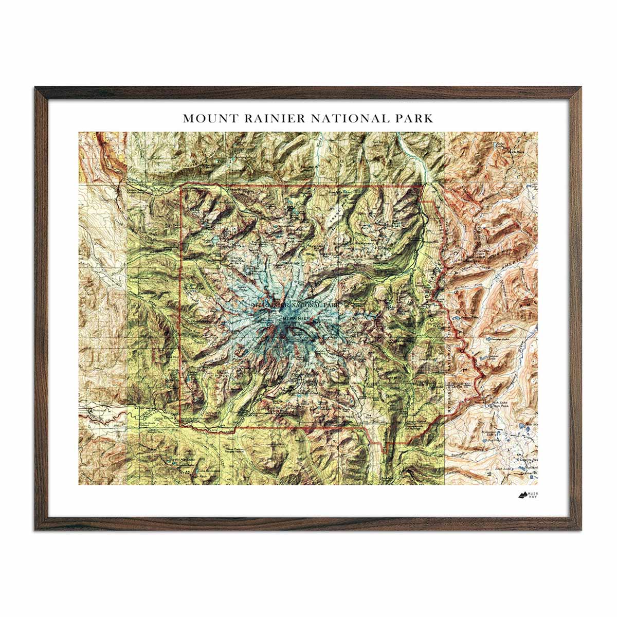
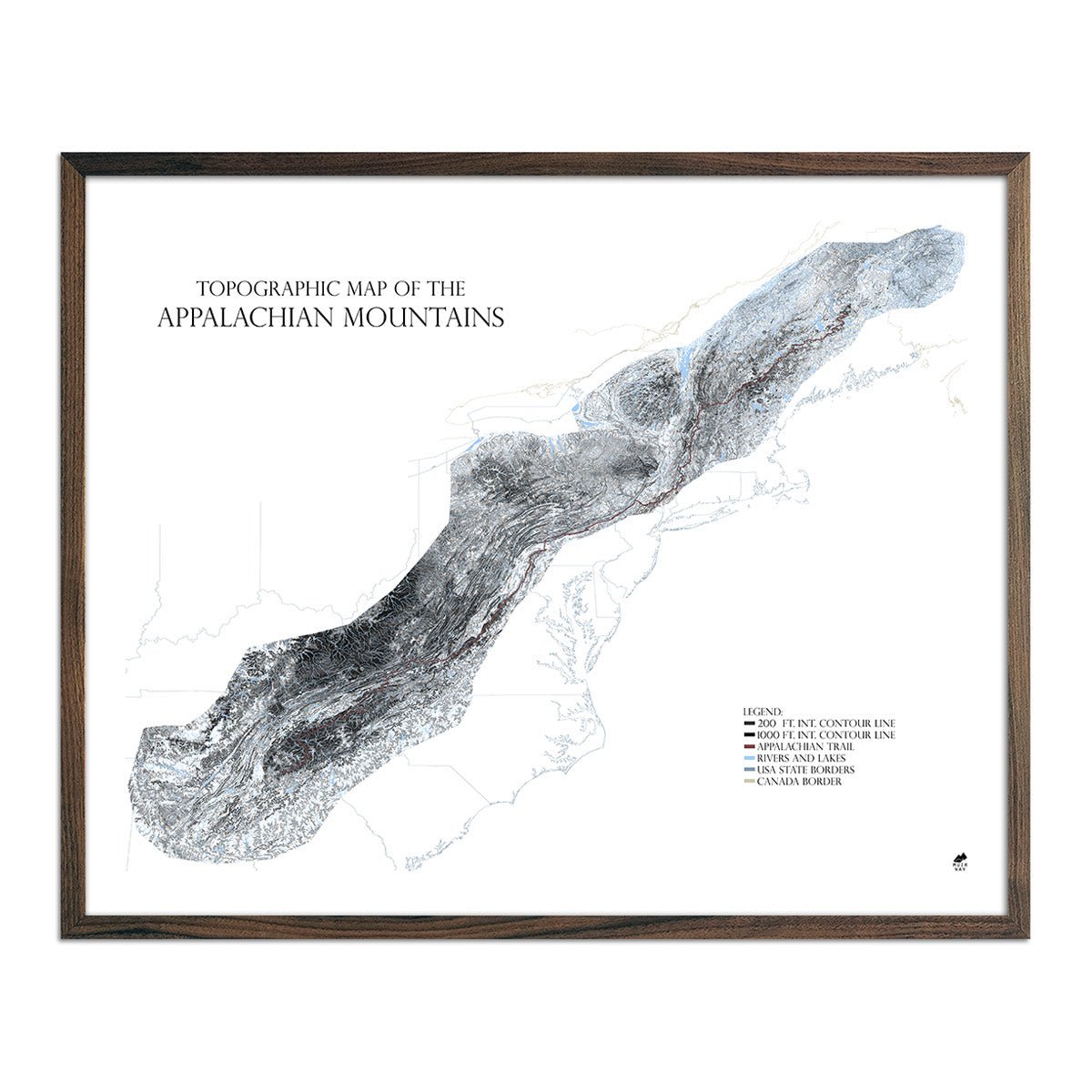
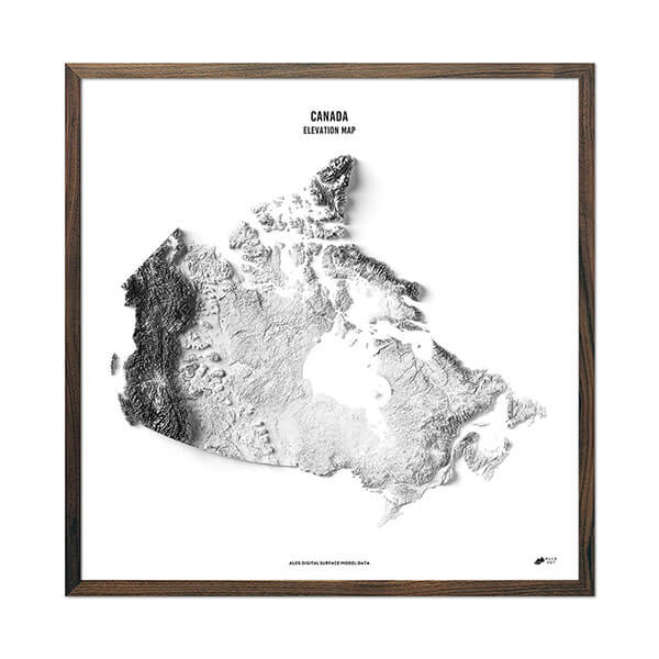
Topographic and elevation maps
Map Example: our topographic map featuring the snowy slopes of Big Sky, Montana
Topographic maps, also known as topo or elevation maps, are maps used to depict real changes from lower to higher elevations. These maps are covered in contour lines – which are essentially just concentric circles that decrease or increase in diameter depending on how close they are to mountain peaks.
Topographic maps are covered in the color brown, as contour lines and other elevation markings tend to be drawn using this color.
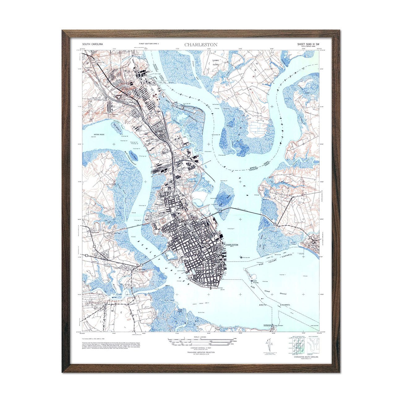
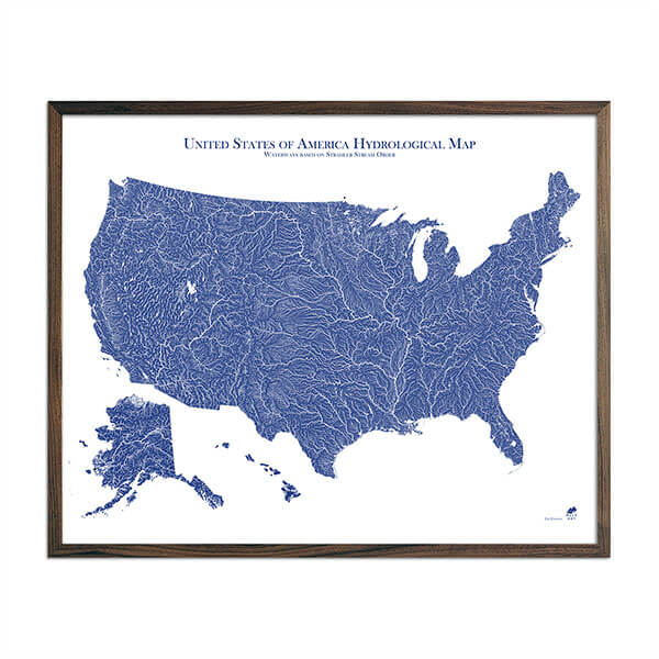
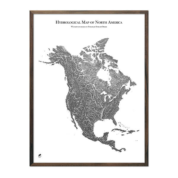
Hydrological maps
Map Example: our black and white hydrological map of the state of Alaska
Maps designed around water fall under the category of hydrological maps – these maps are incredibly gorgeous due to the manner in which water naturally flows across earth’s surface.
Used to trace the flow and origin of all sorts of waterways, hydrological maps are vital tools when it comes to understanding how our planet may function in the face of climate change. Hydrological maps tend to use a lot of light and dark blue coloring, as they’re main purpose is to depict bodies of water.
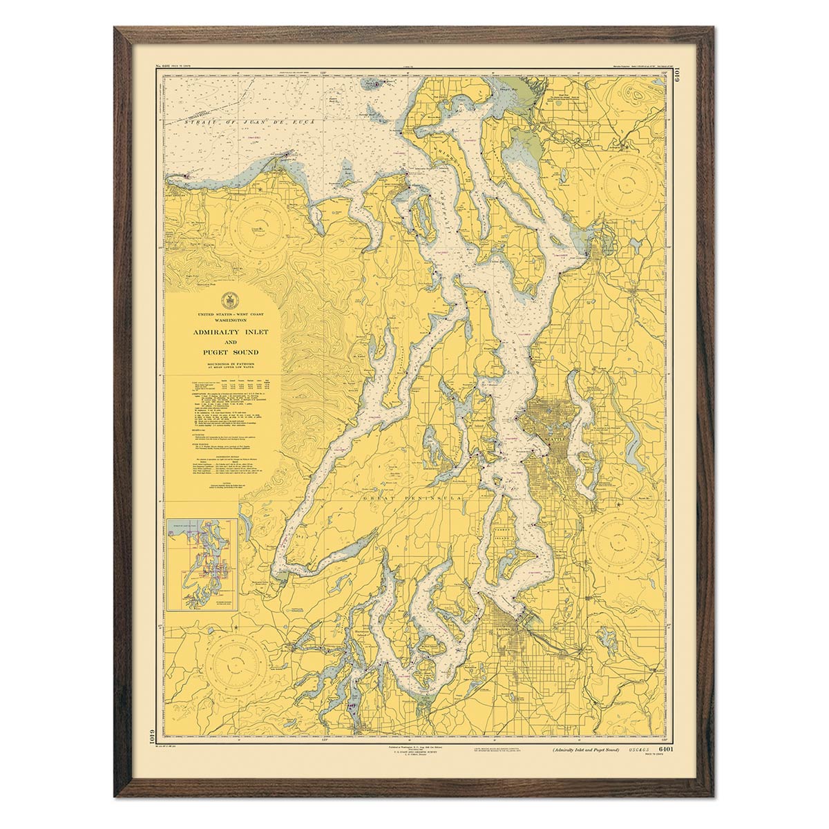
Navigational maps
Map Example: our vintage 1941 San Francisco Bay navigational chart
Navigational maps may also be called nautical charts or even hydrographic charts, and their main purpose is to aid marine navigators throughout their long journeys across ocean or sea. Featuring a different assortment of symbols than other kinds of maps, nautical maps are drawn to include:
-
Latitude and longitude scales
-
Geographic and other natural features
-
Magnetic declination, sea level, and water depth information
-
Coastlines, reefs, and lighthouses
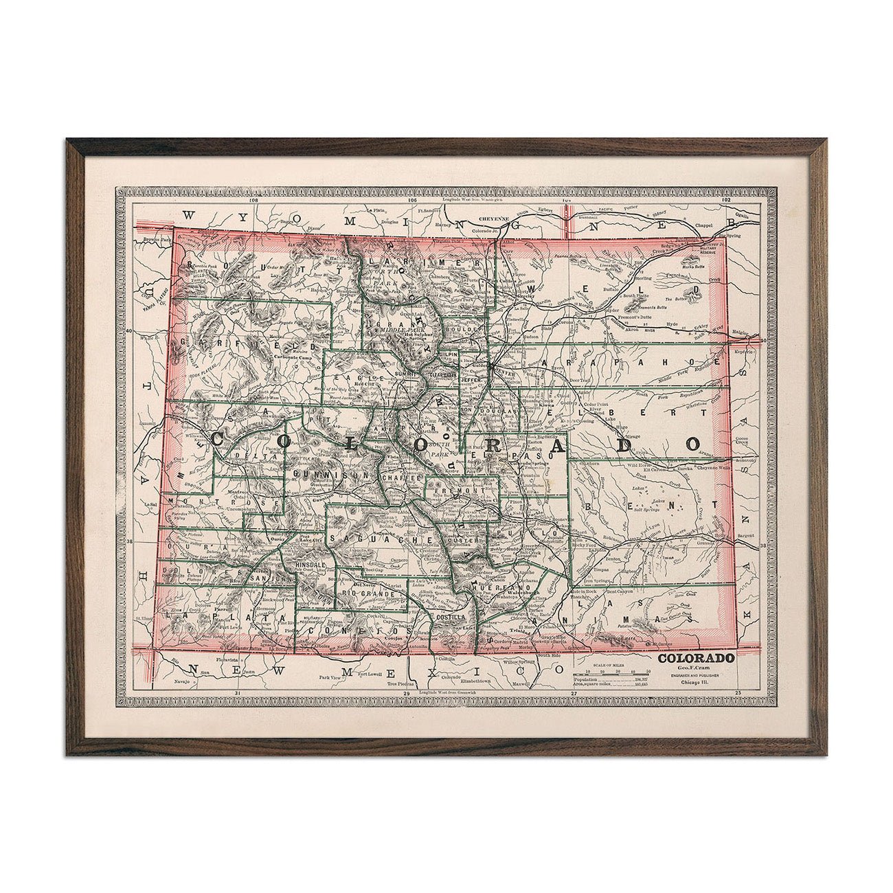
Choropleth maps
Choropleth maps are useful statistical maps that depict specific sets of data that correlate with a region of interest. These maps usually use a small set of colors that range in intensity based on the data used – darker or bold colors often represent higher levels of whatever is being measured.
For example, a map depicting the average yearly income per adult around the world would be a choropleth map, and would most likely use an easy to understand, logical color scheme to avoid confusion. Political maps and maps tracking election info are often choropleth maps as well.
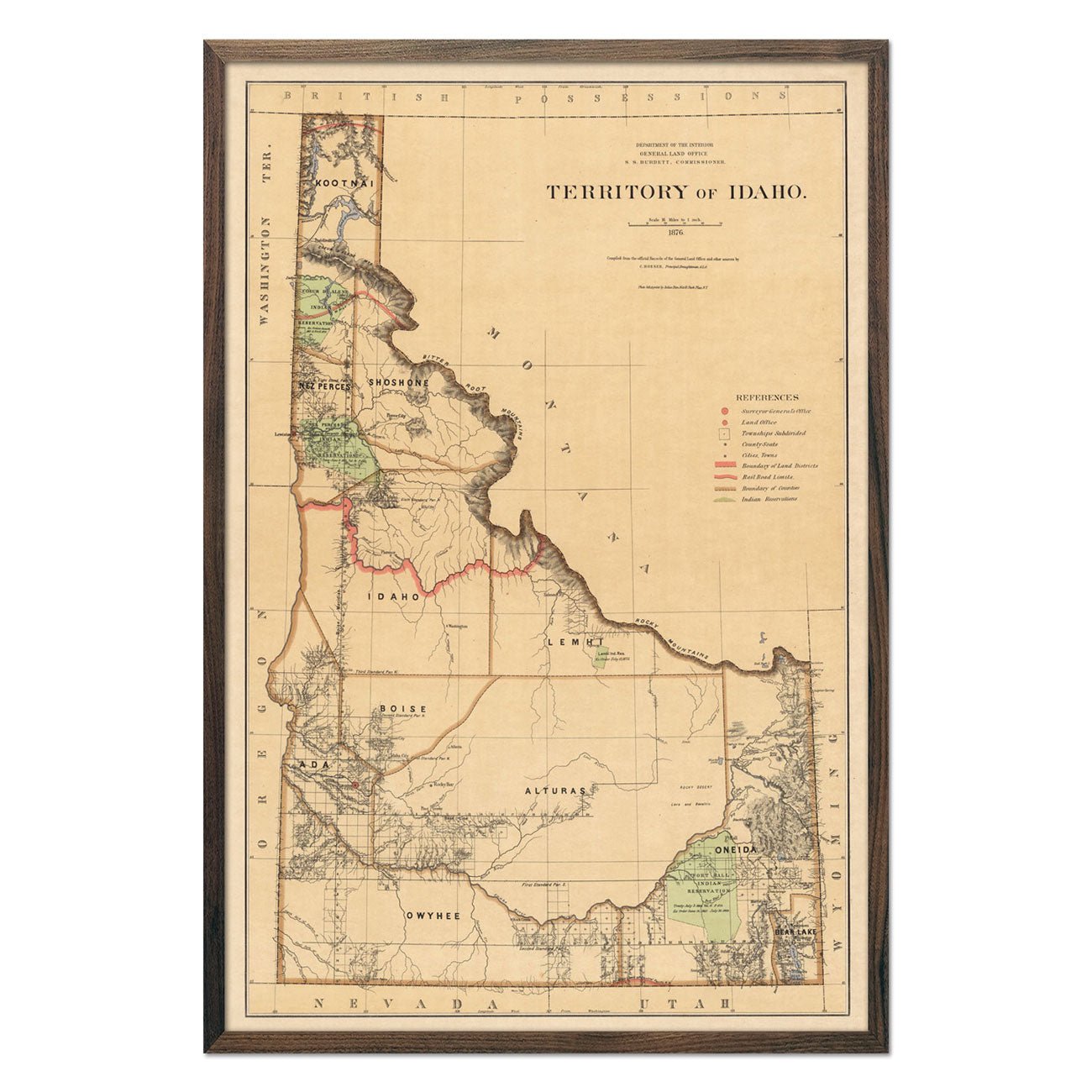
Cadastral maps
The least common type of map on the list, a cadastral map is what’s used to display a cadastre or cadaster – a fancy word for a property line. To put it simply, these maps show local borders and boundaries of land ownership between different regions, counties, or individuals.
These maps don’t always include lots of color coding, but some hues of green, red, yellow, blue, and black are extremely helpful to negotiate property disputes or just map out property lines for future reference.
Google Maps
It's worth including Google Maps on the list as these kinds of app-based maps are the ones we tend to use everyday. Most of us are familiar with common Google Maps colors: greens, blues, yellows and tans, blacks and grays – in fact, Google tends to use traditional map-making colors aside from some filters that are able to layer different elements on top of their base navigational maps.
What other elements are found on a map?
Colors aren’t the things to pay attention to when examining a map. Most maps – no matter what they were created for – will include a map legend, which is basically a key to understanding any other symbols or designs drawn on the map, including:
-
The map’s scale, which provides measurements for distances on the map
-
Grid lines, horizontal and vertical lines that help separate a map into quadrants
-
A compass, which may be in the form of a rose or star and displays the direction of the north pole and south pole, as well as west and east directions
-
Various other details that are usually going to be map specific
Final thoughts
Map color meanings aren't always immediately clear, but they do tend to follow the same rough guidelines no matter who the map-maker is.
Color coding a map is one of the first things most cartographers do during the design phase – and this is true for both vintage recreations and app-based mapping software like Google Maps. If you're interested in learning how to read more complex maps, you should definitely check out some of our other cartography related blog content.